In vibrant contrast to the minimalist tendencies that dominated previous years, 2025 has seen Singaporean designers embracing extraordinarily bold typographic expressions and adventurous color combinations. This exuberant approach draws inspiration from multiple sources, including the resurgent Y2K aesthetic, contemporary street culture, and the visual language of social media.
Oversized Typography
Ultra-bold, oversized letterforms that dominate compositions have become a signature element in advertising, particularly for lifestyle brands, events, and entertainment venues across Singapore.
Iridescent Gradients
Holographic, color-shifting gradients that create a sense of movement and dimensionality appear frequently in digital media, packaging, and environmental graphics.
Neon Accents
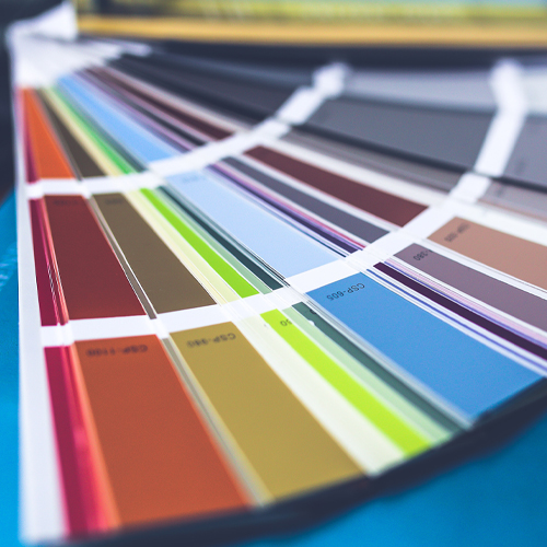
Electric blues, hot pinks, and acid greens provide vibrant punctuation against neutral backgrounds, creating focal points that draw immediate attention in cluttered visual environments.
Persona/Segmentation
Positioning
Marketing Research
Messaging
Portfolio Architecture
Local brands across various sectors are experimenting with these bright, energetic visuals to differentiate themselves in a competitive marketplace. Retail brands targeting younger demographics have been particularly enthusiastic adopters, but even traditionally conservative sectors like banking and healthcare have begun incorporating bolder typographic statements and more vibrant color palettes into their communications.
This trend represents a confident departure from the safe, understated aesthetics that previously characterized much of Singapore’s corporate visual landscape. It signals a maturing design culture willing to take creative risks and an audience increasingly receptive to more expressive visual communications. As this approach evolves, designers are developing sophisticated strategies for balancing visual impact with functionality and brand consistency.